STBKozijnen

Meer dan 15 jaar ervaring
Kosteloos advies bij u thuis
Topkwaliteit producten
Uitstekende service
Concurrerende prijzen
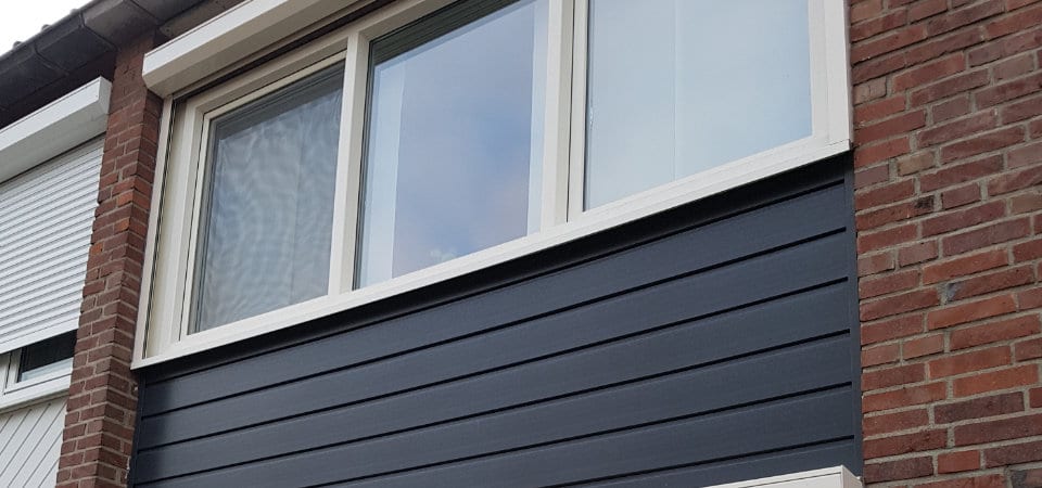
Kunststof kozijnen
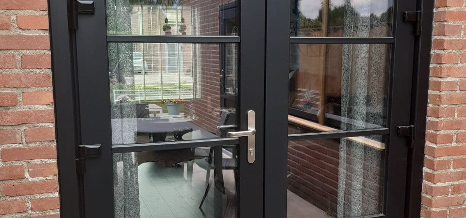
Deuren
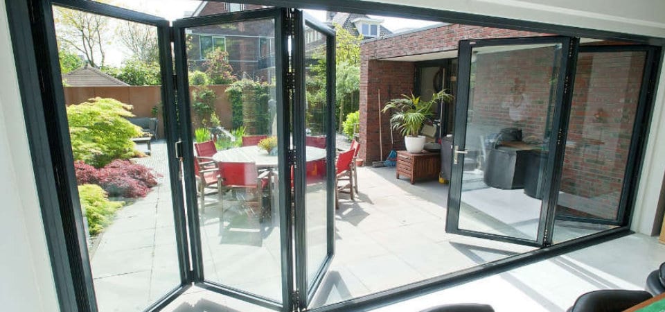
Harmonicadeuren
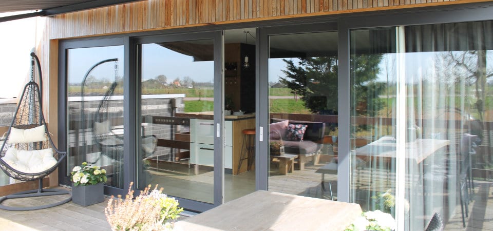
Schuifpuien
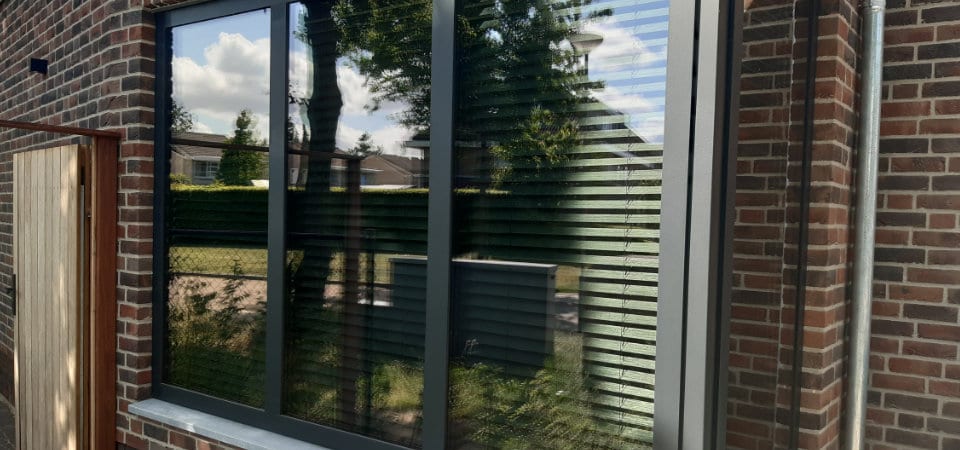
Aluminium kozijnen
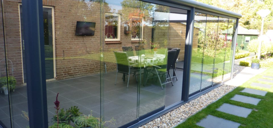
Terrasoverkappingen
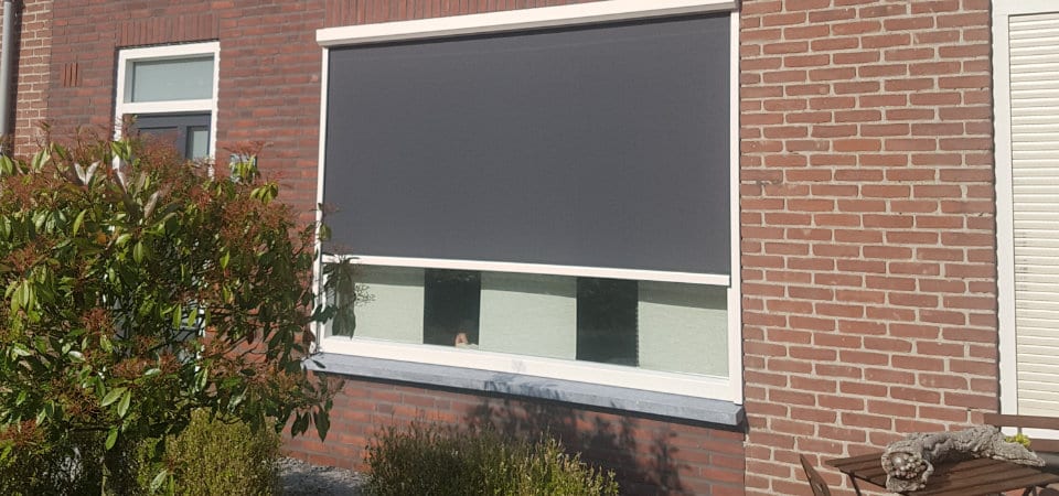
Zonwering
Accessoires
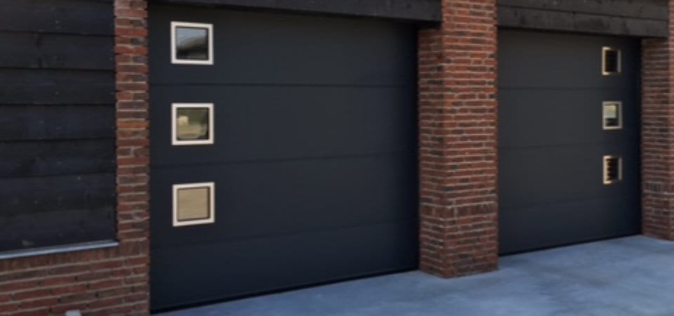
Sectionaal poorten
STBKozijnen
Voor meer dan alleen kozijnen
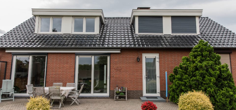
Denkt u erover uw huis een nieuwe uitstraling te geven? Wordt het schilderen van kozijnen of deuren u te veel? Wilt u langer van uw tuin kunnen genieten? Of is uw garagepoort aan vervanging toe? Dan bent u bij STB-Kozijnen aan het juiste adres. Met onze jarenlange ervaring, onze persoonlijke benadering, een neusje voor kwaliteit én een goede prijs, krijgt u bij ons precies het product dat aansluit bij uw wensen.
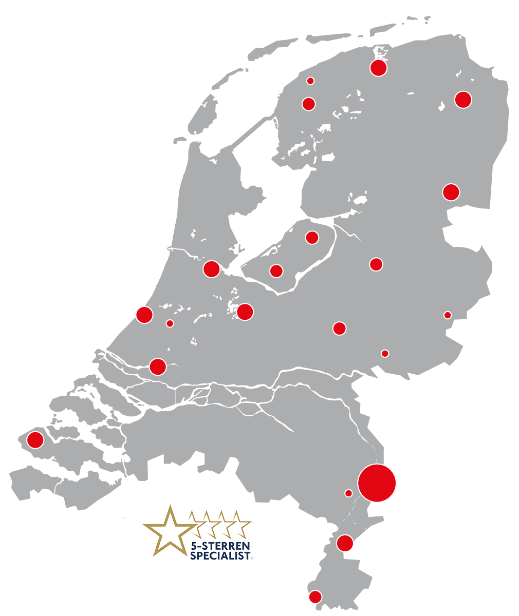
STB-Kozijnen is een 5-sterrenspecialist. Dit is hét keurmerk voor klanttevredenheid.
Het uitgangspunt van STB-Kozijnen is alles voor een tevreden klant. Wij willen u niet slechts een product of dienst verkopen, maar juist een fijne aankoopbeleving bieden. Hoe helpen wij u optimaal en hoe staan we voor u klaar? Wij als een van de 5-sterrenspecialisten vinden het bieden van uitstekende klantbehandeling zelfs zo belangrijk dat we er bewust voor hebben gekozen om ons hierop te ontwikkelen en te laten controleren.
Diensten
Leveranciers / Producten / Merken | Kozijnen | Deuren | Schuifpuien | Aluminium kozijnen | Terrasoverkappingen | Zonwering | Sectionaal poorten | Accessoires
Hoofdkantoor
Groesweg 34a
5993NN Maasbree
Kantoor
Kaldenkerkerweg 20
5913AE Venlo
Contact
T: +31774 402 200
E: info@stb-kozijnen.nl
Openingstijden
| Ma. t/m do | 09:00 - 17:00 |
| Vr. | 09:00 - 16:00 |